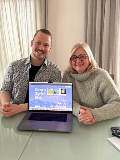
Replacing Airbnb with a custom booking site increased my client’s revenue by 16%.
Here is how I did it.
Introduction
This project involved the end-to-end design and development of a fully custom booking platform that enabled my client to move away from Airbnb and reclaim the 16% platform fee previously deducted from every booking. The aim was to build a streamlined, branded, and highly automated inquiry-to-book system tailored precisely to the client’s business needs.
Through close collaboration, we mapped the ideal user journey for both guests and host, eliminating manual admin work while preserving the sense of trust and professionalism that third-party platforms typically provide. The result is a lean, event-driven booking solution combining a premium marketing website with a private management dashboard, automated payments and automated email workflows.
In this article, I’ll break down the architecture, user experience decisions, technical trade-offs, and measurable business impact of delivering a robust, fully independent booking ecosystem.
The Aim of the Project
The primary aim of this project was to give the client full independence from third-party booking platforms while preserving the trust, simplicity, and reliability those platforms provide.
More specifically, the project set out to:
- Increase Revenue Per Booking
Eliminate Airbnb’s 16% platform fee and allow the client to retain more profit from every confirmed stay. - Replace Platform Trust with Brand Trust
Design a premium, cohesive digital experience that would inspire the same level of confidence guests typically associate with large booking platforms. - Automate the Inquiry-to-Book Workflow
Remove manual email coordination, bank transfer tracking, and repetitive admin tasks by building an event-driven, automated system. - Centralise Booking Management
Provide a private dashboard where all inquiries, payments, guest details, and booking records are stored in one secure location. - Deliver a Lean, Intuitive User Experience
Reduce friction for both guests and host, ensuring the custom solution felt simpler than Airbnb.
The solution
I designed a lean custom web app. In collaboration with the client i was able to tailer an inquiry-to-book workflow to their precise needs. I reduced the number of manual emails needed per booking to zero and gave the business a premium and consistent brand identity.
This private booking platform has 2 main parts.
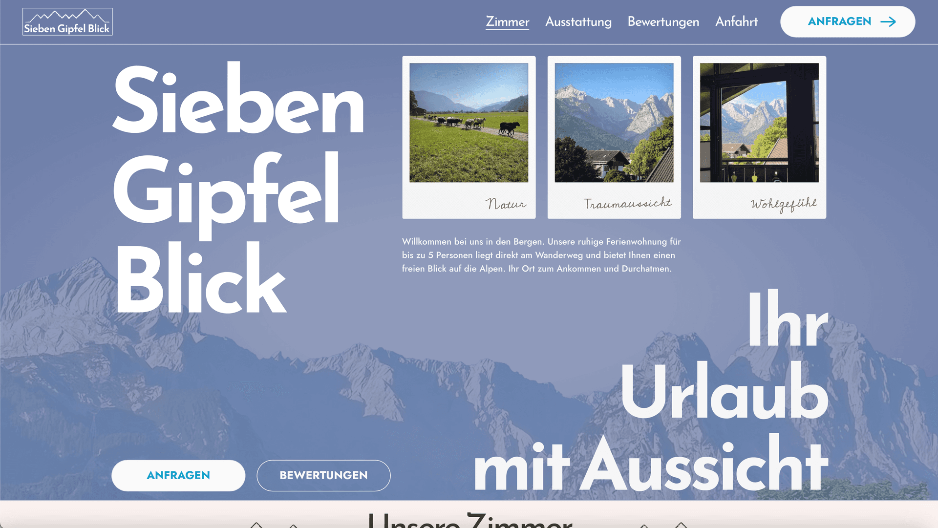
Marketing website: a custom designed custom built client facing marketing website accompanied by matching email templates. This site provides prospect guests with the information they need to make a booking decision. The consistent and professional branding inspires confidence and trust in the booking process. This is a crucial substitute for the inherent customer trust that Airbnb provides.
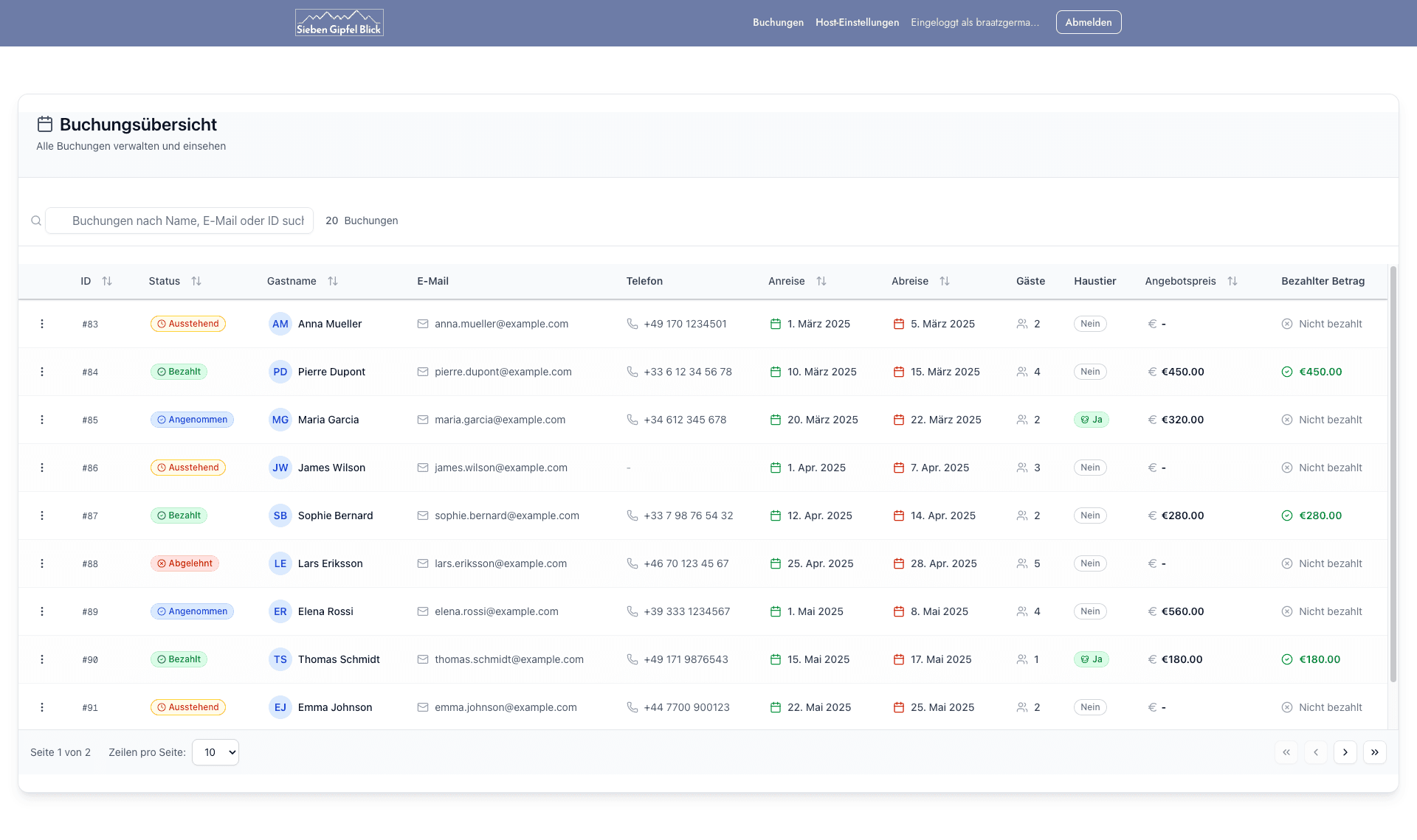
Booking management platform: a private booking management platform consisting of a private admin dashboard and automated workflows for sending emails and taking payments. The design provides a lean version of the traditional inquiry-to-book workflow.
Outstanding User Experience design was crucial in delivering an intuitive and effective solution. By reducing friction for both the host and the guests i was able to make the site an enjoyable alternative to Airbnb.
For guests, the experience is strait forward:
- Explore the reviews, amenities, and property details
- See a clear price estimate breakdown before they send the request
- Select a date range and submit an inquiry
- Receive an email when the host confirms, with a link to payment
- After payment, receive a pre-arrival email (scheduled for one day before check-in)
Consistent branding is used across the website, emails, and the payment pages. This makes the experience feel professional and builds user trust in the site.
For the host, I removed all manual admin work:
- They get an email when a new inquiry is submitted
- They click through to a private dashboard to inspect details
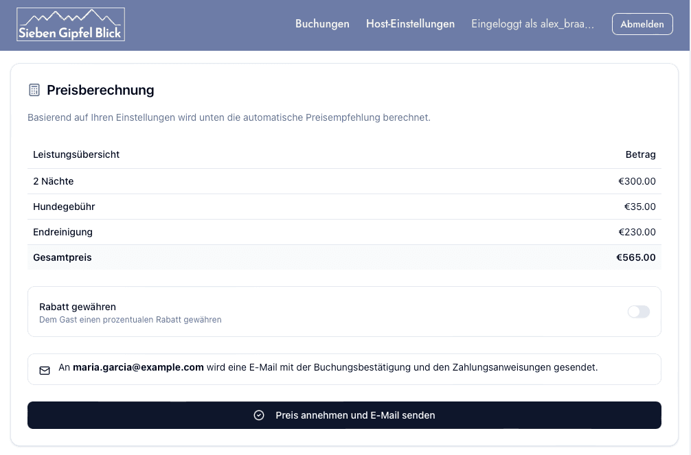
- They choose or adjust the price, then accept (or decline)
- Once paid, the booking is automatically marked as “paid” and all info is stored centrally
Accepting a standard booking now takes two clicks!!
No manual copying of customer info.
No chasing bank transfers.
No repetitive emails.
Architecture
Customer-facing site:


- Next.js
- React
- Tailwind CSS
- Framer Motion
- Figma
This Stack let me translate my Figma design into a responsive site that works smoothly on desktop, tablet and mobile, with unique interactivity at great performance.
Admin dashboard + automated workflows:


- Next.js + TypeScript (type-safe server actions)
- Supabase (Postgres + Auth)
- Stripe for dynamic payments
- Resend for email delivery
- Serverless functions + cron jobs for scheduled emails
The workflow is event-driven a successful Stripe payment triggers a webhook that updates booking state and sends confirmation emails automatically.
Impact
Financial impact
- 16% more revenue per booking
- Equivalent to one extra booking’s earnings per six bookings

Operational impact
Compared to organising a booking manually without Airbnb, we made the admin process 36 times faster! The Host can now do in 5 minutes what would have taken 3 hours of email coordination and tracking bank transfers and other sensitive user data.
What I learned
Frontend
Building a stacking cards UI using scroll. I built an animation where cards stack on top of each other as the user scrolls down the page. To get this right, I had to pay close attention to how position sticky, the scroll container height, card height, top alignment, and top margins all interact. The final effect uses position sticky plus Framer Motion tracking of scroll progress to drive the stacking behavior.
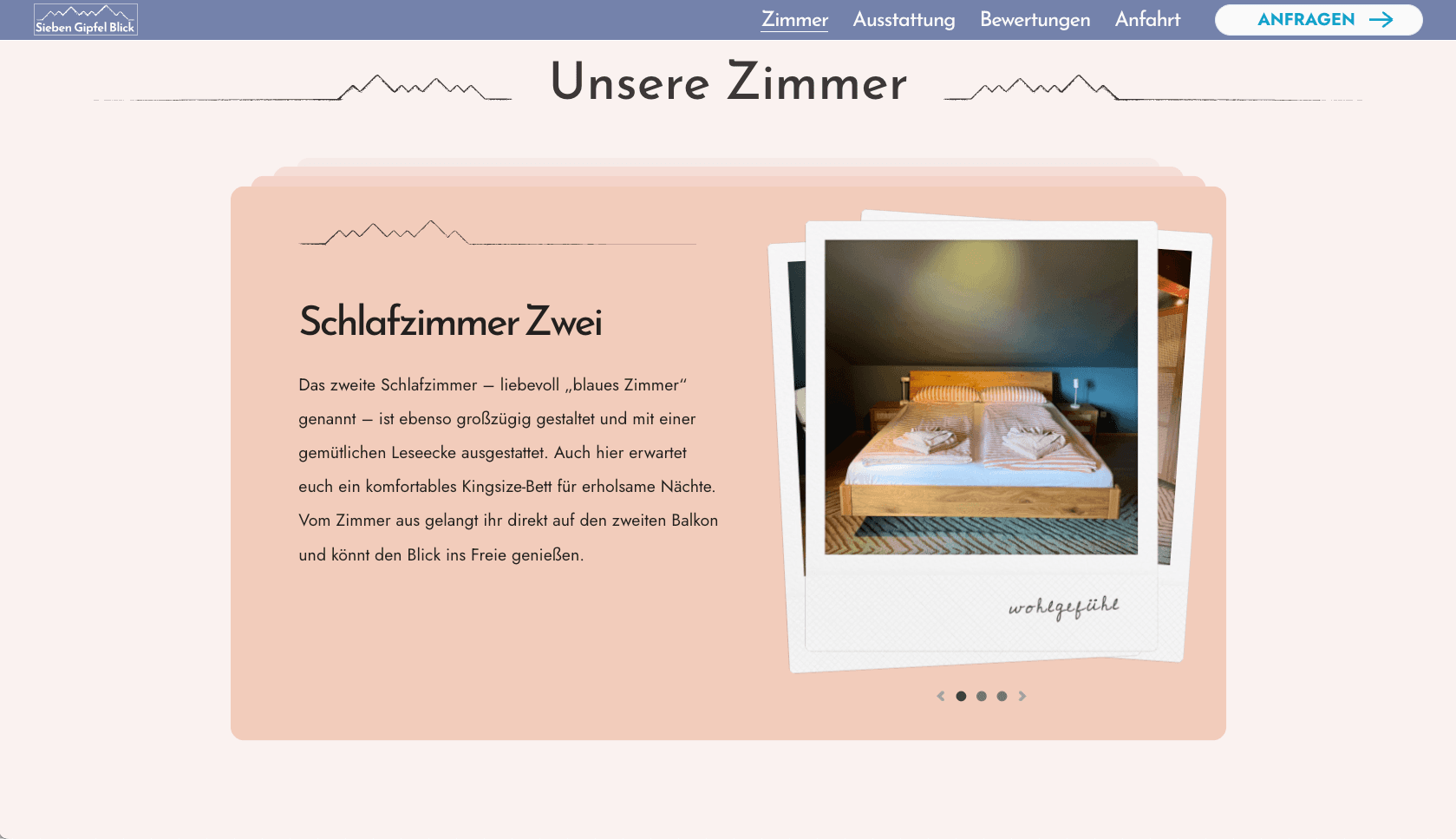
Building a user-controlled shuffle animation. I also created a playful “Polaroid shuffle” animation so users can click through different room images. The main challenge was choosing the right moment in the animation to change z-index to avoid visible clipping as images overlap. Instead of using CSS keyframes, I tracked animation progress in component state so the user can drive the shuffle by clicking from one photo to the next.
Trade-offs
Custom dashboard instead of a stitched-together SaaS workflow. I chose to build a custom dashboard where the client can manage bookings and customer details in one place, rather than stitching together existing tools (e.g. google forms + manual tracking + manual emails). This required more upfront work, but the result was a simpler and more automated workflow. The client valued having everything in one place and not needing to learn multiple systems.
Backend
Designing a robust event-driven architecture. I designed the booking system to tolerate failures and remain eventually consistent across distributed parts of the workflow. I did this by using idempotency keys to prevent duplicate email sends, and retry logic to ensure emails and database updates still complete after transient failures. I achieved this without adding explicit job queues by leaning on Stripe and Resend’s built-in retry and idempotency features.
Leveraging TypeScript generics. For the email-sending layer, I used TypeScript generics to strongly couple each email template with the props it expects. This makes it easy to add new templates while keeping type safety. TypeScript can validate at build time that the template and props match, which reduces the risk of runtime bugs and time-consuming email debugging. A union-based approach could work, but generics scale more cleanly as the number of templates grows.
Integrating Stripe. I chose Stripe for its developer experience and the quality of its dashboard (useful if the client ever needs to handle refunds). I implemented dynamic pricing on the server and embedded Stripe Checkout components into a custom checkout page, instead of using a redirect-to-Stripe URL flow. This kept the user experience cohesive, and it let the client set or adjust pricing from the admin dashboard rather than managing prices directly in Stripe.
Ensuring database security. I protected user data while still supporting database writes from unauthenticated users. I did this with RLS policies in PostgreSQL, combined with tightly controlled usage of the service role key from server-only function calls.
Trade-offs
- No explicit rate limiting: Unauthenticated users can trigger certain writes, but I assessed the likelihood and business impact of abuse as low for this project. Adding rate limiting infrastructure was not justified at this stage.
- No separate email job queue: I relied on Resend retry logic plus idempotency keys, because the expected email volume is low enough that a dedicated queue would add complexity without clear upside.
Project delivery
Agile iteration with the client using prototypes. Close collaboration with the client improved the final outcome. Getting feedback early surfaced important insights while changes were still cheap, and reduced the amount of work I had to throw away later.
I also learned that details matter, even during early exploration. Keeping spelling, tone, and placeholder copy on-brand helped feedback sessions stay focused on the product, instead of getting distracted by avoidable rough edges.
Balancing genAI with Handcoding.
For the customer-facing site, I wrote everything by hand. The design was highly intentional, with complex animations and delicate responsive breakpoints in the hero section, and I wanted full control over the implementation.
For the admin interface, I took a different approach. I used genAI (Cursor’s Composer in agentic mode) to accelerate scaffolding and repetitive sections, while giving very explicit guidance on structure and constraints. I found AI most effective when extending an existing patterns like wiring up existing form inputs with zod and React Hook Form and Zod based, or for generating email templates that followed the established front-end styles.
Trade-offs
I spent a longer time coding features by hand where precision was important for brand experience or data security and sped up iteration where how things worked was more important then how they looked, selectively adding extra polish by hand afterwards.
What I’d do differently
If I were starting again, I would likely choose a less custom approach for the marketing site. While the bespoke animations and interactions add personality and polish, the additional development time wasn’t fully justified by the extra “wow” factor. A simpler design system like Relume could have delivered nearly the same user confidence with significantly less effort.